


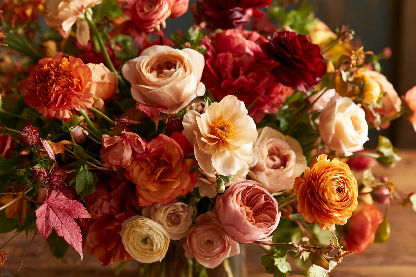
Autumn colors feel cohesive not simply because they belong to the same season, but because they share a secret: warm undertones. Rust, amber, burgundy, and golden yellow often contain hidden traces of red or brown, creating an underlying relationship even when their surface colors differ. This shared warmth gives a bouquet a natural sense of continuity.
But a successful fall palette doesn’t need to include every familiar autumn shade. In fact, a limited, intentional selection often feels much more luxurious. Here is your professional guide to mastering autumn color harmony, balancing bold blooms, and designing stunning fall floral arrangements.
Floral Color Theory 101: The Building Blocks
To design like a pro, it helps to understand the three qualities that shape how flowers interact with one another:
- Color Temperature: Is the hue warm (reds, oranges, yellows) or cool (blues, purples, cool greens)?
- Value: This refers to the relative lightness or darkness of a color. Pairing colors with different values creates definition and depth, while similar values create a quiet, blended effect.
- Saturation: How vivid or muted is the color? A rich, saturated dahlia will naturally draw the eye, while a pale, softened neutral gives it room to stand out.
💡 Florist Pro Tip: Cool accents absolutely can work in an autumn arrangement! The trick is to balance their temperature by matching their value and saturation to your warmer blooms.
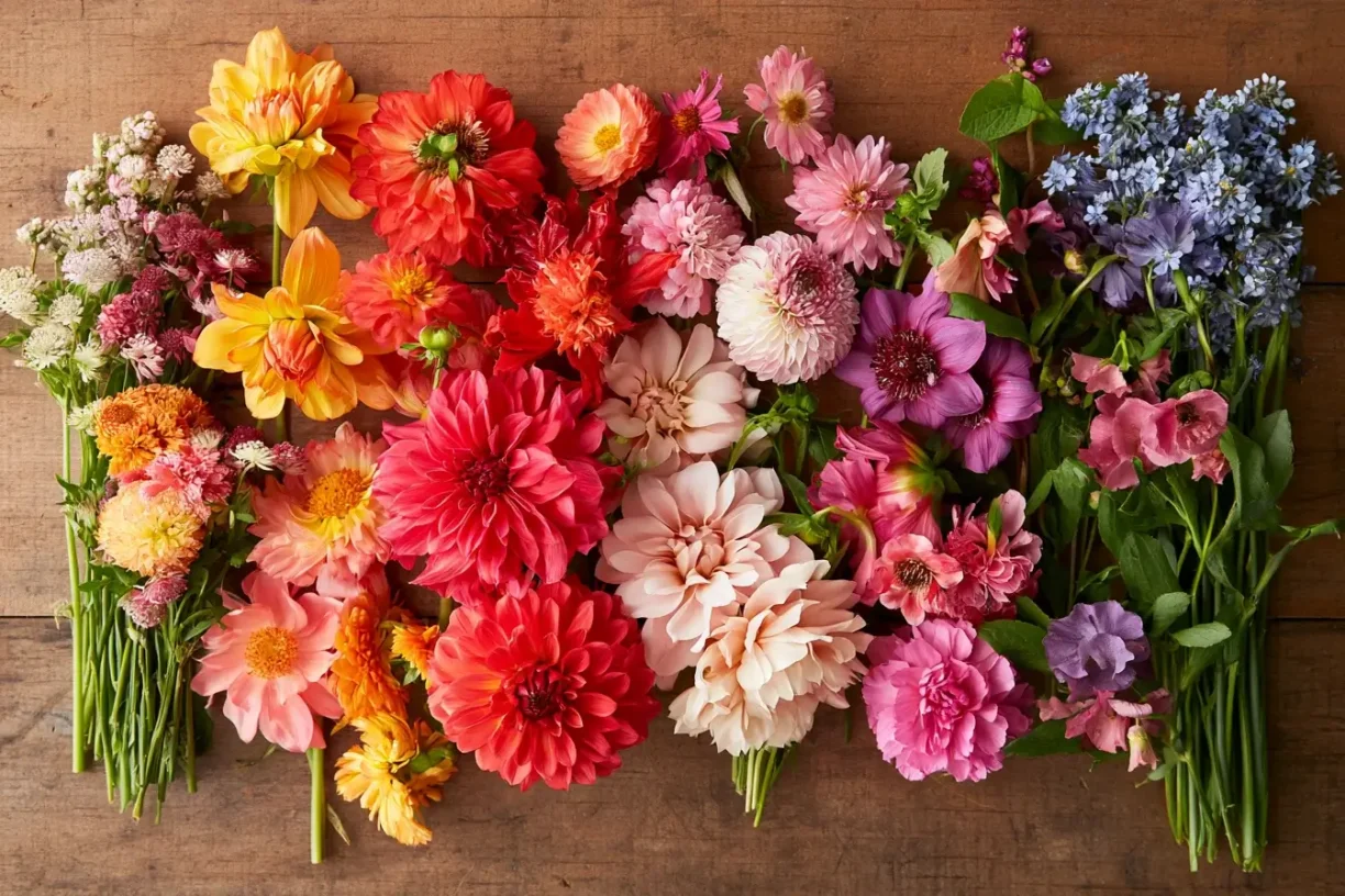
The Secret Ingredient: How Foliage Unifies Your Palette
Foliage is the unifying thread that allows contrasting flower colors to sit comfortably together. Leaves, grasses, seed heads, and branches connect blooms through shared natural textures and seasonal tones—from olive and bronze to muted green and brown.
A single sprig of foliage can bridge a vivid orange flower and a subdued mauve bloom without making either color feel out of place. The goal isn’t to eliminate contrast, but to give it context. When you combine a clear point of difference with a repeated botanical element, the arrangement feels intentional and harmonious.
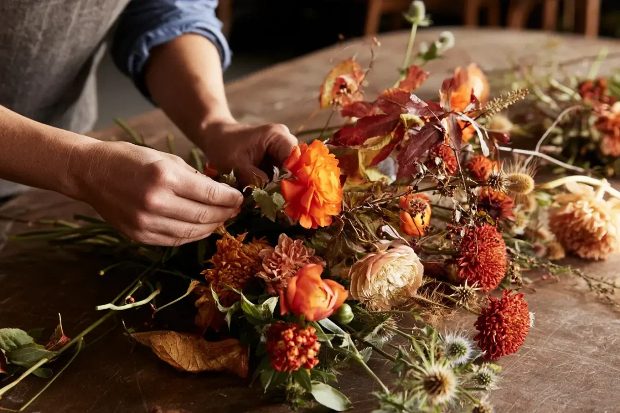
2 Signature Autumn Palettes to Try This Season
Ready to design? Here are two stunning, florist-approved color palettes for your Thanksgiving and fall arrangements.
Palette 1: Deep & Moody (Burgundy & Chocolate)
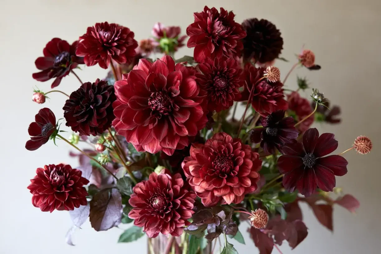
A rich, atmospheric palette that feels luxurious and dramatic without becoming heavy.
- The Focal Point: Burgundy Dahlias. Their layered petals create generous volume and a saturated, wine-colored center of attention. Choose varied head sizes and allow some stems to sit slightly above or below the main cluster for movement.
- The Depth: Chocolate Cosmos. These near-black blooms add incredible depth without competing with the dahlias. Their delicate, open petals contrast beautifully with the rounded dahlia heads.
- The Bridge: Dark foliage, like deep green or plum-toned leaves, reinforces the dramatic mood and provides structure.
- The Balancing Act: To keep this scheme legible, introduce small amounts of lighter material—like dusty rose, soft taupe, pale seed heads, or restrained cream flowers. Place them sparingly to guide the eye and open up visual space.
Palette 2: Warm Harvest (Burnt Orange, Mustard & Olive)
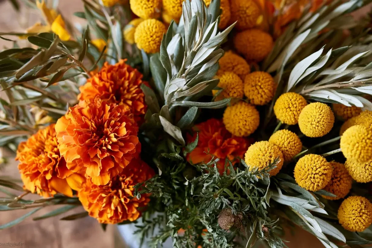
A grounded, natural palette that brings cozy, fireside warmth to any table.
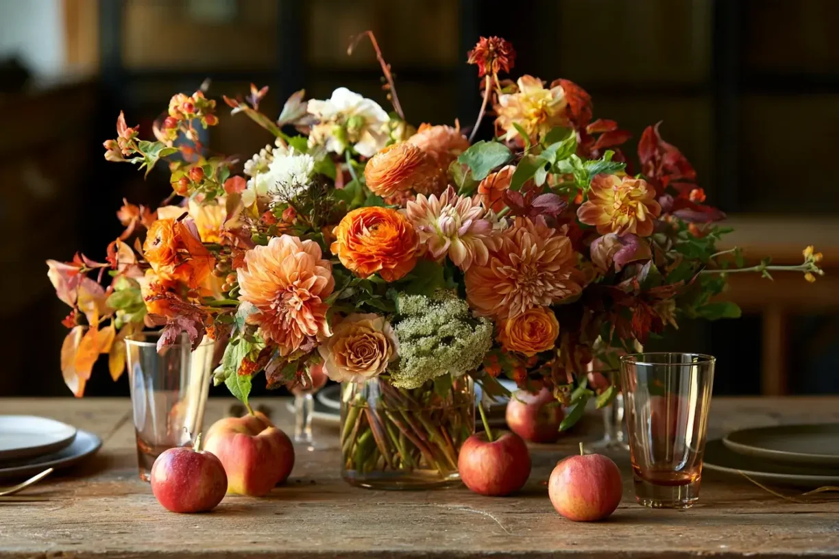
- The Focal Point: Burnt Orange Marigolds. Their saturated petals draw the eye and give arrangements a welcoming glow. Cluster them together to guide attention.
- The Brightness: Mustard Craspedia. These rounded, golden “billy balls” add a playful contrast to the marigolds’ layered petals. They lift the arrangement without the sharpness of a vivid yellow.
- The Bridge: Olive Branches. Their muted, slender foliage softens the contrast between orange and yellow, adding movement and an understated, cultivated finish.
- The Proportion Rule: Let the quiet textures form a substantial base. A good starting ratio: Green (largest) > Orange (prominent) > Yellow (smallest accent).
Pro Tips for Visual Balance & Negative Space
Autumn arrangements often draw attention through saturated shades of rust, burgundy, ochre, and plum. To keep these colors expressive rather than crowded, follow these professional styling rules:
1. Use Foliage as “Visual Pauses”
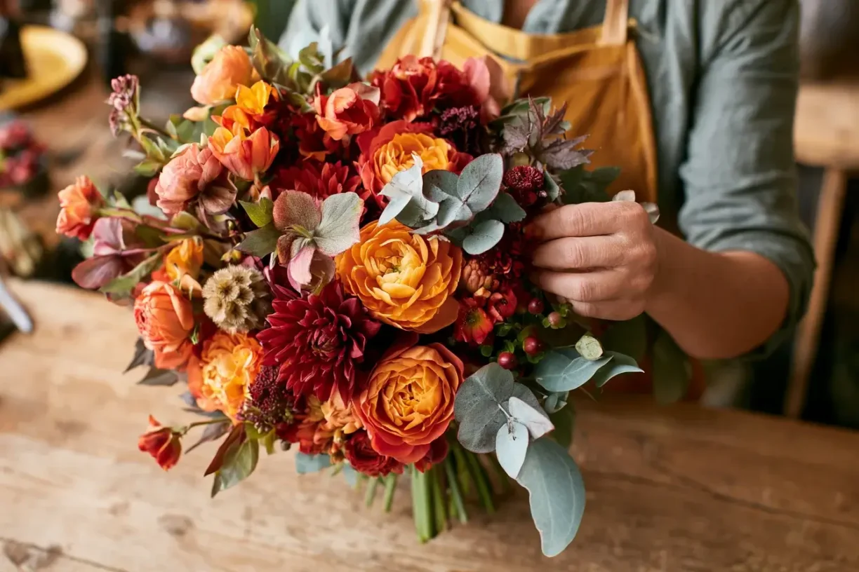
Don’t treat greenery as just filler! Use quiet-toned foliage like seeded eucalyptus, dusty miller, or muted salal as visual pauses between vivid flowers. Place foliage exactly where two intense blooms meet to let each hue remain distinct.
2. Control Visual Weight
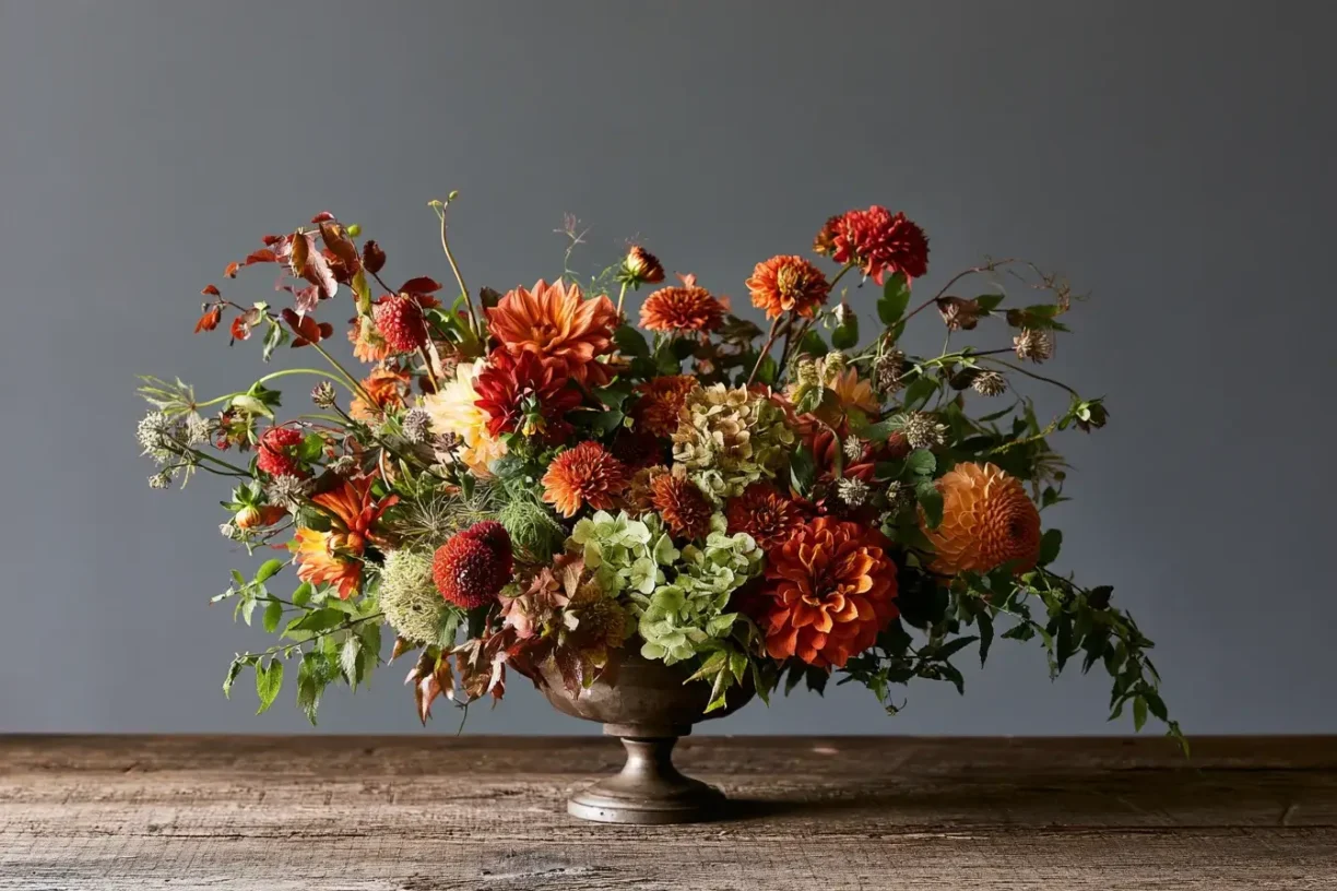
Balance dense flower clusters with open intervals. Negative space is not wasted space; it helps strong shapes register and prevents a bouquet from appearing packed.
- For hand-tied bouquets: Leave small gaps near the rim and let greenery extend lightly beyond the blooms.
- For centerpieces: Space focal clusters evenly so guests can see across the table.
3. Start with a Dominant Color
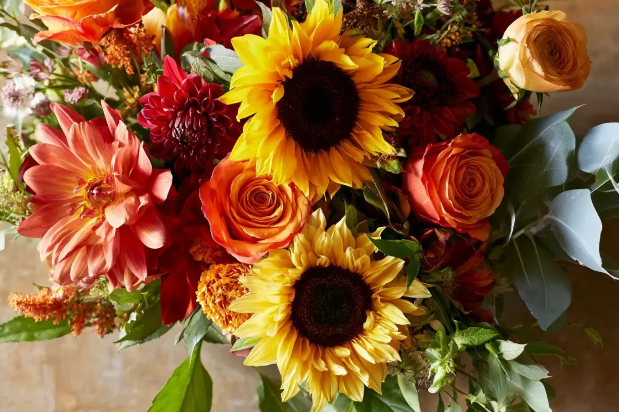
Build most of your arrangement around one dominant shade (e.g., rusty orange), then add one or two accents for contrast (e.g., plum for depth, pale apricot for lift). Repeat the dominant hue in several places to create continuity, and use neutral foliage to connect colors that might otherwise clash.
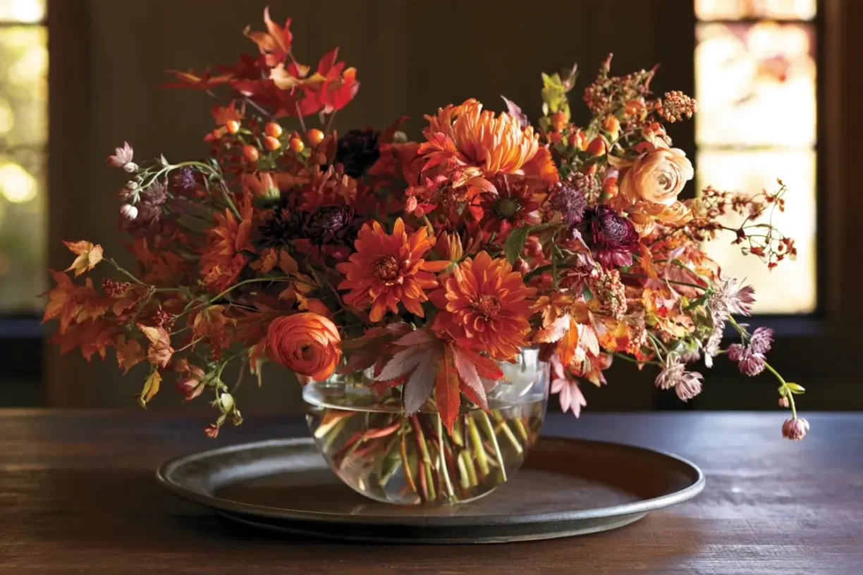
Whether you are designing a moody, dramatic tablescape or a bright, harvest-inspired centerpiece, mastering color harmony is the key to professional-looking fall florals.
Want to skip the trial and error this Thanksgiving?
Let our expert floral designers bring these stunning autumn palettes to life for you.
Shop Our Custom Thanksgiving Centerpieces or Book a Floral Design Consultation today!